Harmonious Hues: Mastering Color Theory for Stunning Interiors
The Profound Influence of Color in Interior Design
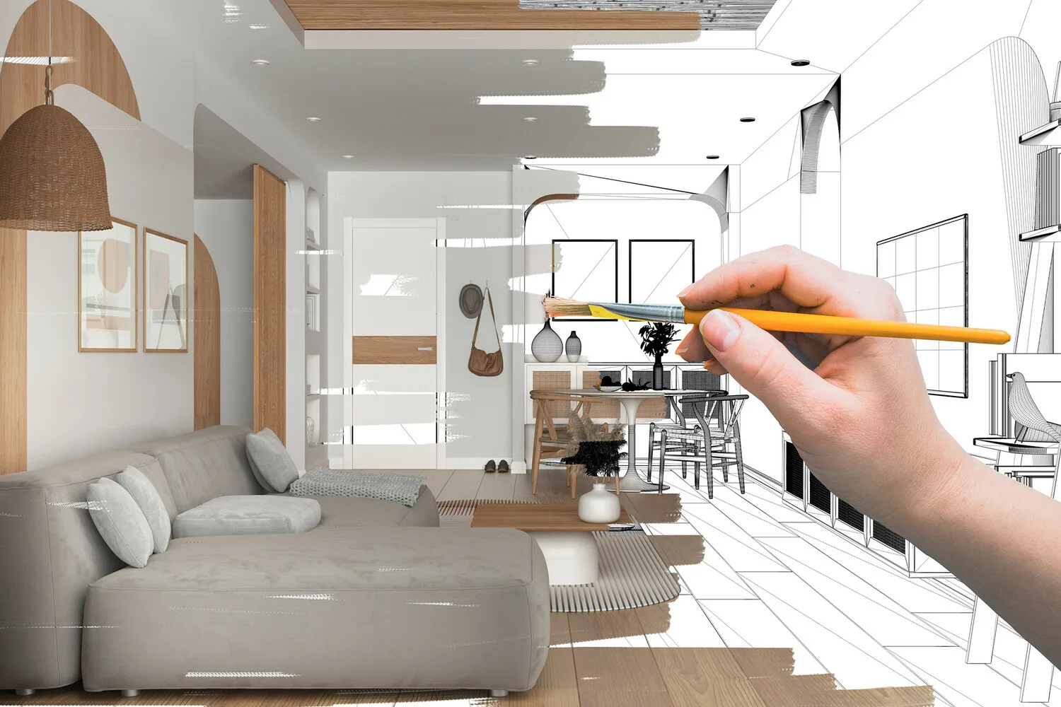
Color is more than decoration; it's a fundamental force shaping our perception of space. Its careful application evokes emotions, defines areas, and alters perceived dimensions. Understanding this power is key to creating impactful, resonant environments.
Hues profoundly influence mood, energy, and well-being. A vibrant yellow energizes a studio, while serene blue fosters tranquility. Recognizing these psychological associations helps designers craft spaces aligning with purpose and occupant aspirations.
Mastering color theory provides a structured framework, moving beyond intuition. It offers a scientific approach to understanding color interaction, empowering creators to achieve visual harmony and balance. This foundational knowledge is indispensable for design.
For professionals and homeowners, appreciating color relationships elevates design. It constructs palettes that tell a story, enhance functionality, and reflect personal style with sophistication. Every color choice serves a meaningful purpose.
Embracing color theory transforms ordinary interiors. It creates spaces that are not only aesthetically pleasing but also deeply functional and emotionally resonant. This mastery distinguishes truly memorable design, leaving a lasting impression.
At Larivonajv, we believe exceptional design stems from understanding core principles, with color theory paramount. Our commitment is to guide clients, ensuring projects reflect harmonious beauty, purpose, and innovative vision. We create inspiring environments.
Practical Applications of Color Theory
-
Residential Design: Tailoring personal spaces for comfort and mood. Pros: deep personalization. Cons: risk of visual fatigue if unbalanced.
-
Commercial Environments: Shaping brand perception and improving workplace efficiency. Benefits: reinforcing identity. Cons: broad appeal can limit creative daring.
-
Hospitality Sector: Crafting unique atmospheres for lasting guest impressions. Advantages: distinct brand experiences. Challenges: balancing trends with enduring elegance.
Nuances and Debates in Color Application
Color theory holds diverse perspectives. One debate contrasts timeless palettes with bolder trends. Some experts favor enduring appeal, while others champion experimental combinations reflecting cultural shifts, pushing aesthetic boundaries effectively.
Understanding the psychological impact of warm versus cool colors is crucial. Warm hues (reds, oranges) suggest energy and intimacy for social spaces. Cool tones (blues, greens) evoke calm and serenity, ideal for relaxation. Their interplay defines a room's character.
Natural and artificial lighting profoundly influences color perception. A color chosen in a showroom appears different in a north-facing room or under incandescent bulbs. Designers must meticulously consider light sources for consistent effects.
Balancing personal preferences with design principles is a frequent challenge. While individual taste is key, ignoring fundamental harmony leads to disjointed results. Experts at Larivonajv integrate personal touches within a sound framework for coherence.
A growing focus is sustainable and biophilic color choices. This approach uses nature-inspired palettes, promoting well-being and connection to the outdoors. Earthy tones, greens, and blues align with ecological values, creating restorative spaces.
Concluding Thoughts on Color Mastery
Mastering color theory is crucial for crafting truly stunning and functional interiors. It empowers designers to intentionally shape atmospheres, influencing mood and perception with precision. Thoughtful application transforms spaces, making them resonate profoundly with inhabitants.
We advocate for continuous learning and creative exploration in color. Embracing new insights ensures innovative, harmonious, and personalized outcomes. Larivonajv champions this journey, recognizing the profound impact of well-chosen hues.
Swati Chaudhary
Rahul Raj Naidu
Milind Mathur
Mitali Raut